The U.S. Department of Labor fosters, promotes, and develops the welfare of the wage earners, job seekers, and retirees of the United States by improving working conditions, advance opportunities for profitable employment and assure work-related benefits and rights.
The Problem
To identify pain points I conducted a heuristic evaluation of the U.S. Department of Labors website. In the websites current state it's user accessibility rate is quite low particularly when searching with keywords or topics. There's an overwhelming amount of text displayed on each page along with buttons and cluttered hyperlinks.
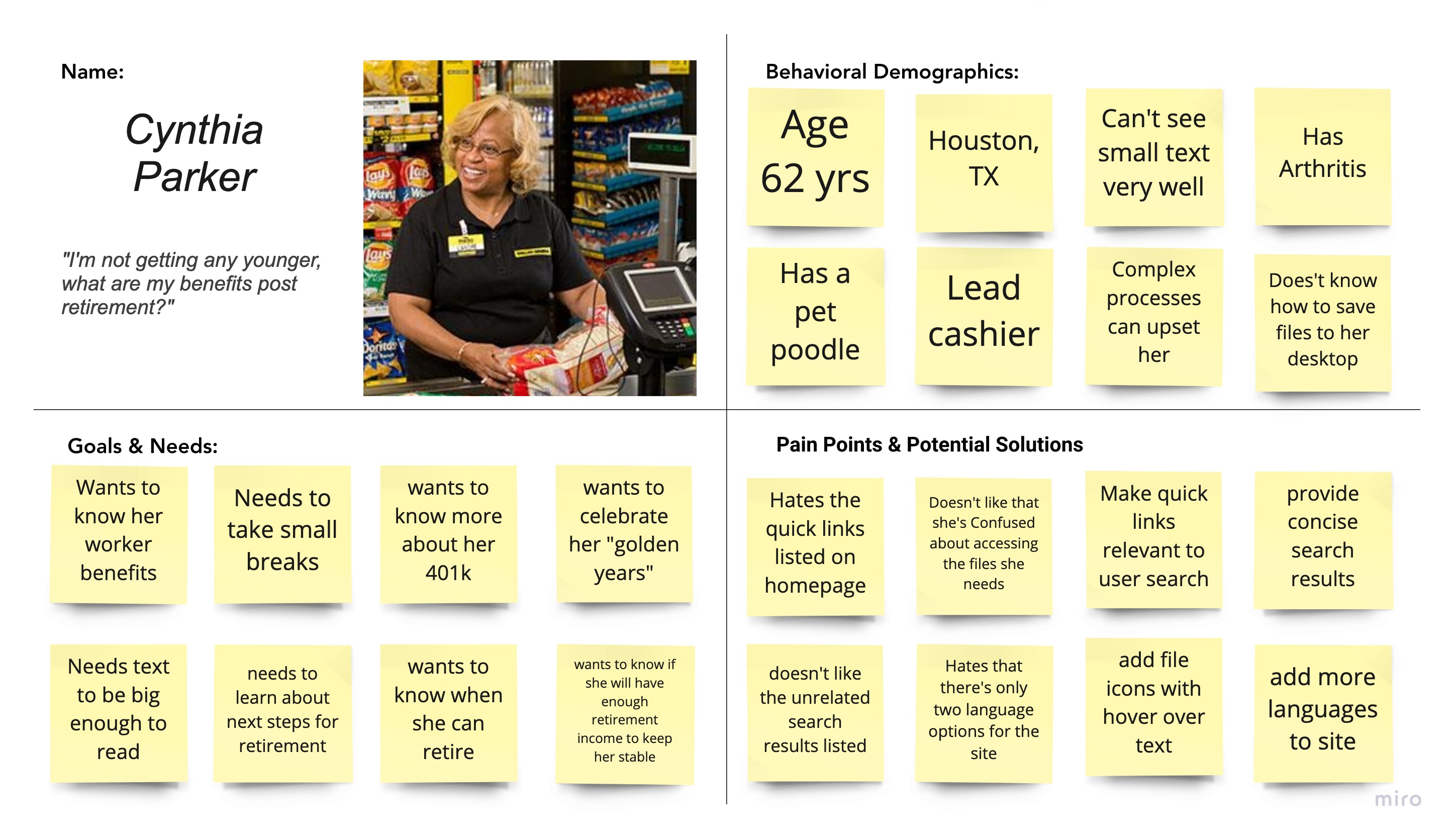
Proto Persona
To further measure website accessibility I created a proto persona, Cynthia Parker, who's seeking retirement information from the U.S. Department of Labor. She has a couple of personal pain points that might deter her from reaching her website destination making her the ideal user.
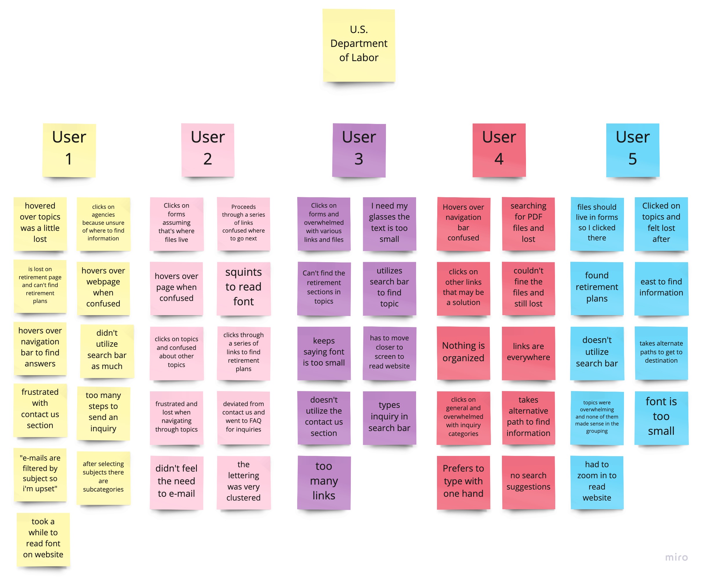
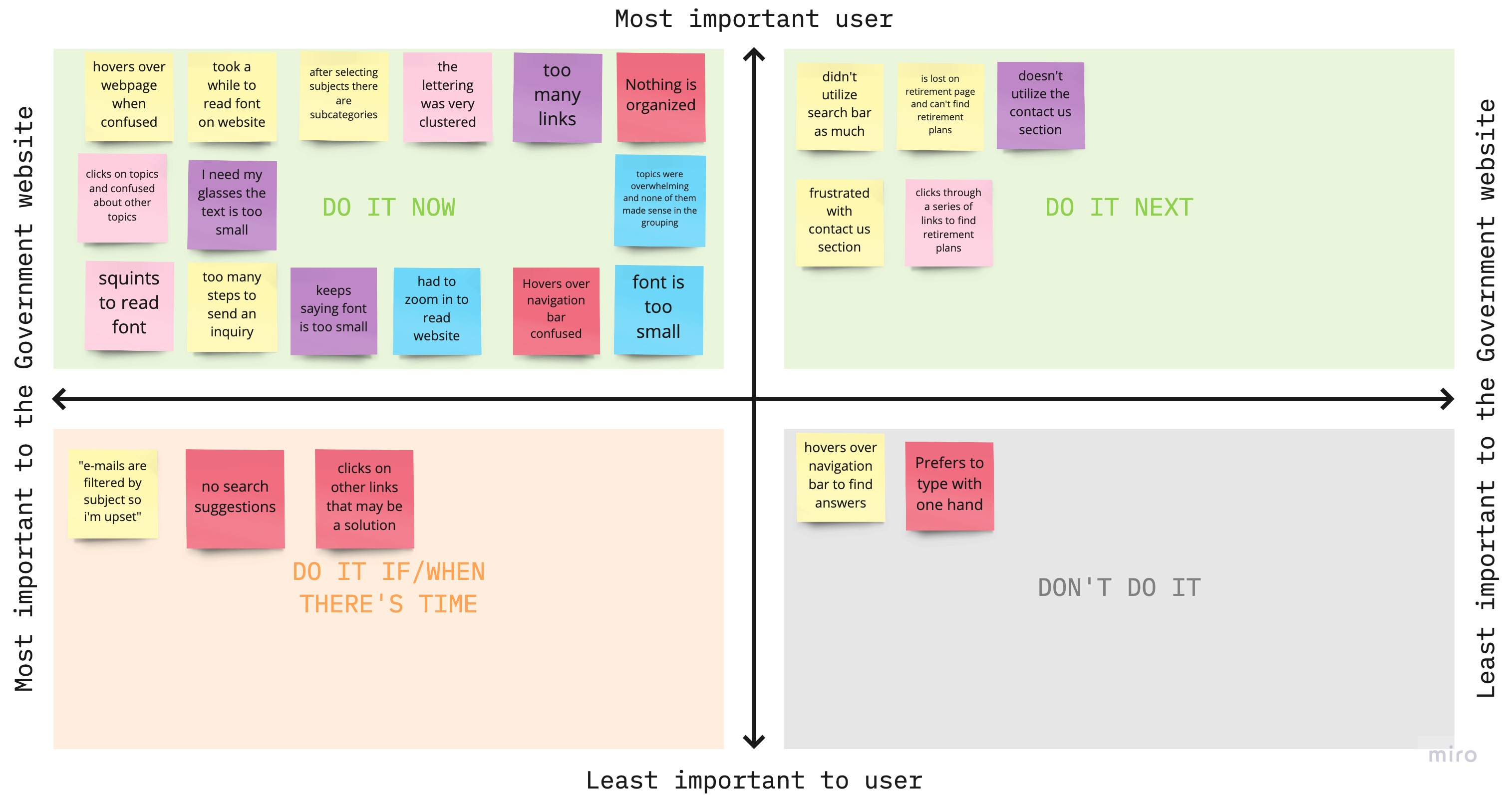
Then I conducted five user testing sessions via zoom to observe if users were able to complete tasks given. I organized my user insights into groups where I was able to extract and synthesize them into a priority matrix map. My biggest opportunities included the following; text was too small and cluttered, there's too many links, topics were mixed and overwhelming, too many steps to get to your destination.
Competitors
I researched other government websites to learn what keeps them competitive and unique to their users. After meticulous observations I was able to uncover that most government websites pose a cognitive overload with information, mixed text hierarchy, and unrelated search links. Some of the cons were; legible text, easy to locate icons, alphabetized navigation menu links, and tool tips for immediate assistance.
Card Sorting
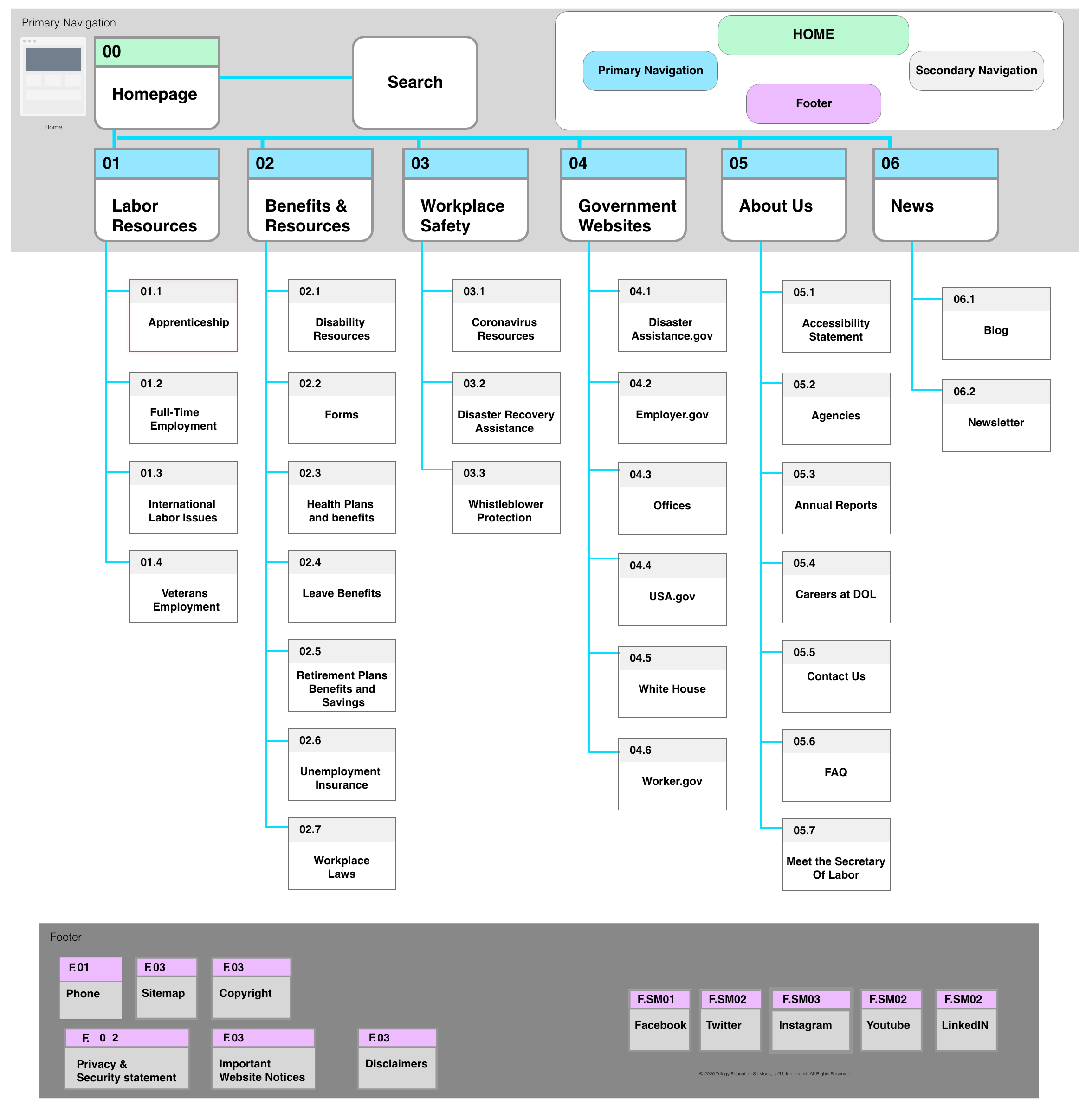
The U.S. Department of Labor website needs to be redesigned to best meet user needs and makes sense to it's users. In order to evaluate the current information architecture I conducted card sorting sessions with users like my user persona Cynthia Parker. Through the define, group, and structure method I was able narrow the most relevant topics that make sense to users. Then categorized relevant topics into secondary menu labeling.
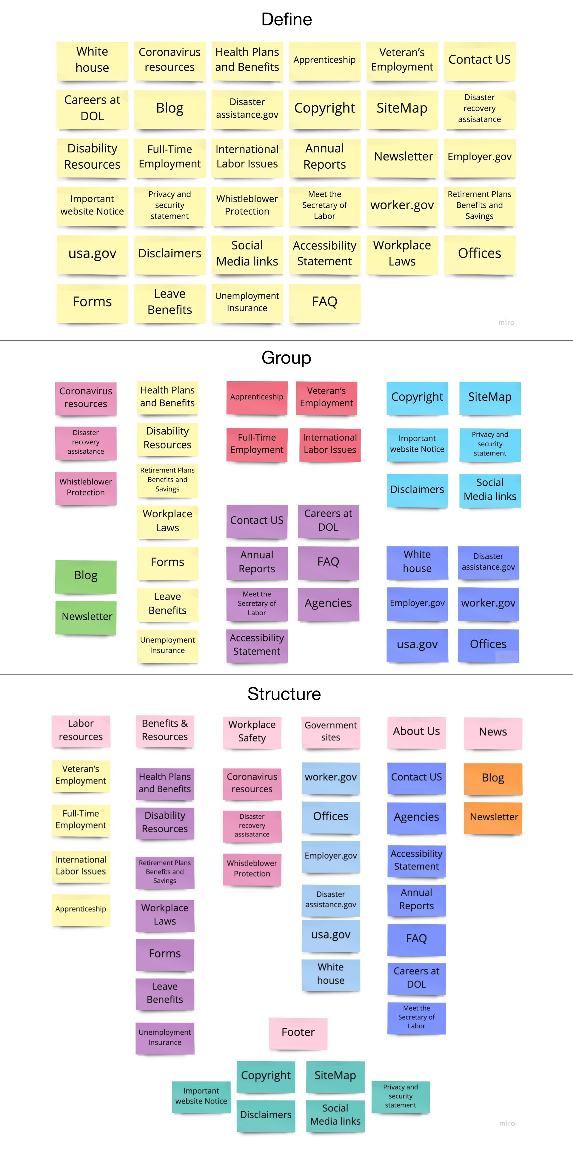
After card sorting I was able to create a sitemap with primary and secondary menu labeling. Primary menu labeling is organized based off user card sorting insights and website needs. Secondary menu labeling is filtered into respective primary menu labeling and alphabetized to easily locate topics.
Prototype
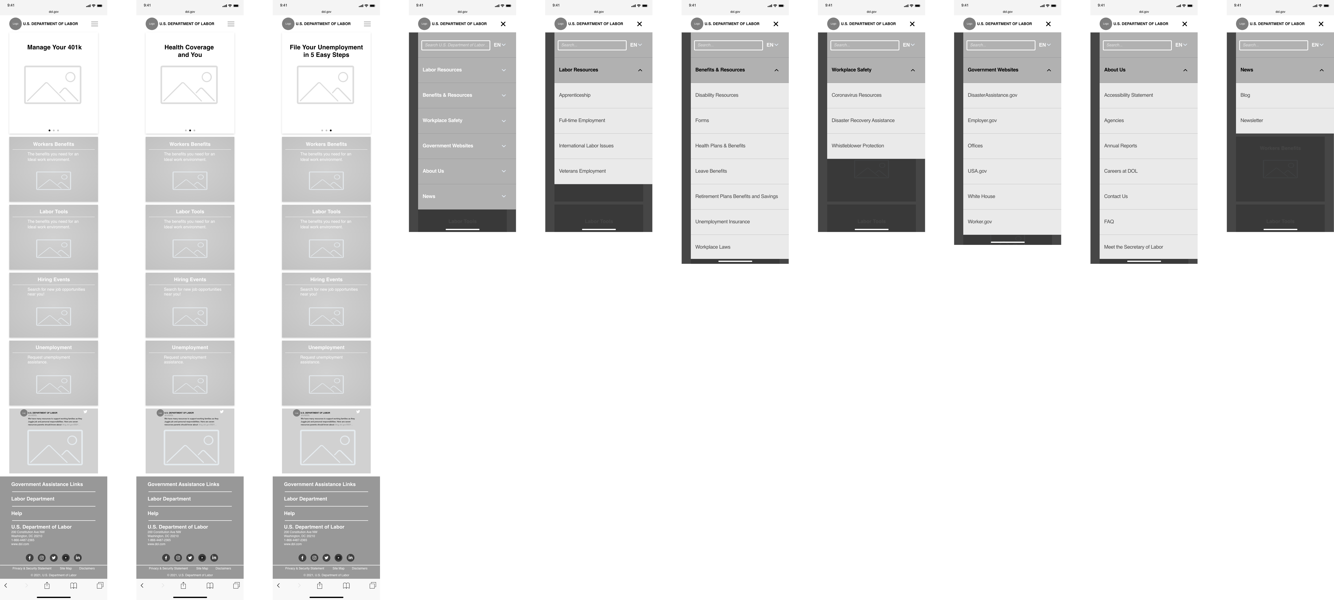
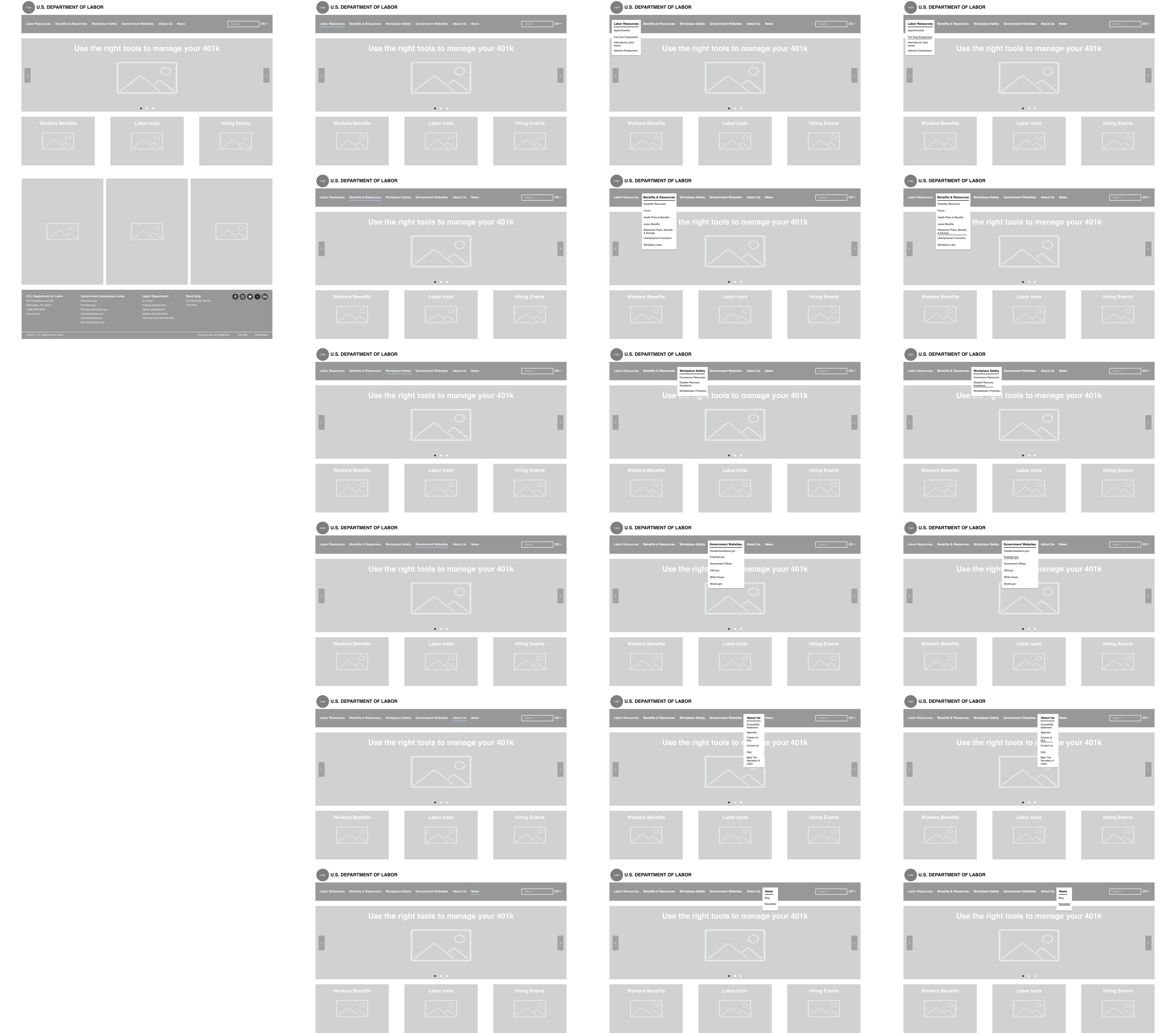
The first prototype consisted of an accessible navigation menu and hover state labeling to identify users current location. I incorporated a clickable carousel with information regarding current topics and popular searches. Below the carousel are cards with suggested topics that make sense to our users. I removed text clutter from the footer then added hierarchy to labeling and moved social media icons above copyright text.
User Testing
Now I had to test the redesigned prototype to reveal any accessibility issues. I facilitated five in person user testing sessions via zoom. I discovered that users were able to identify carousel and card topics but had trouble reading the smaller text. Search bar text was also iterated to inform users they're searching the website.
Style Tile
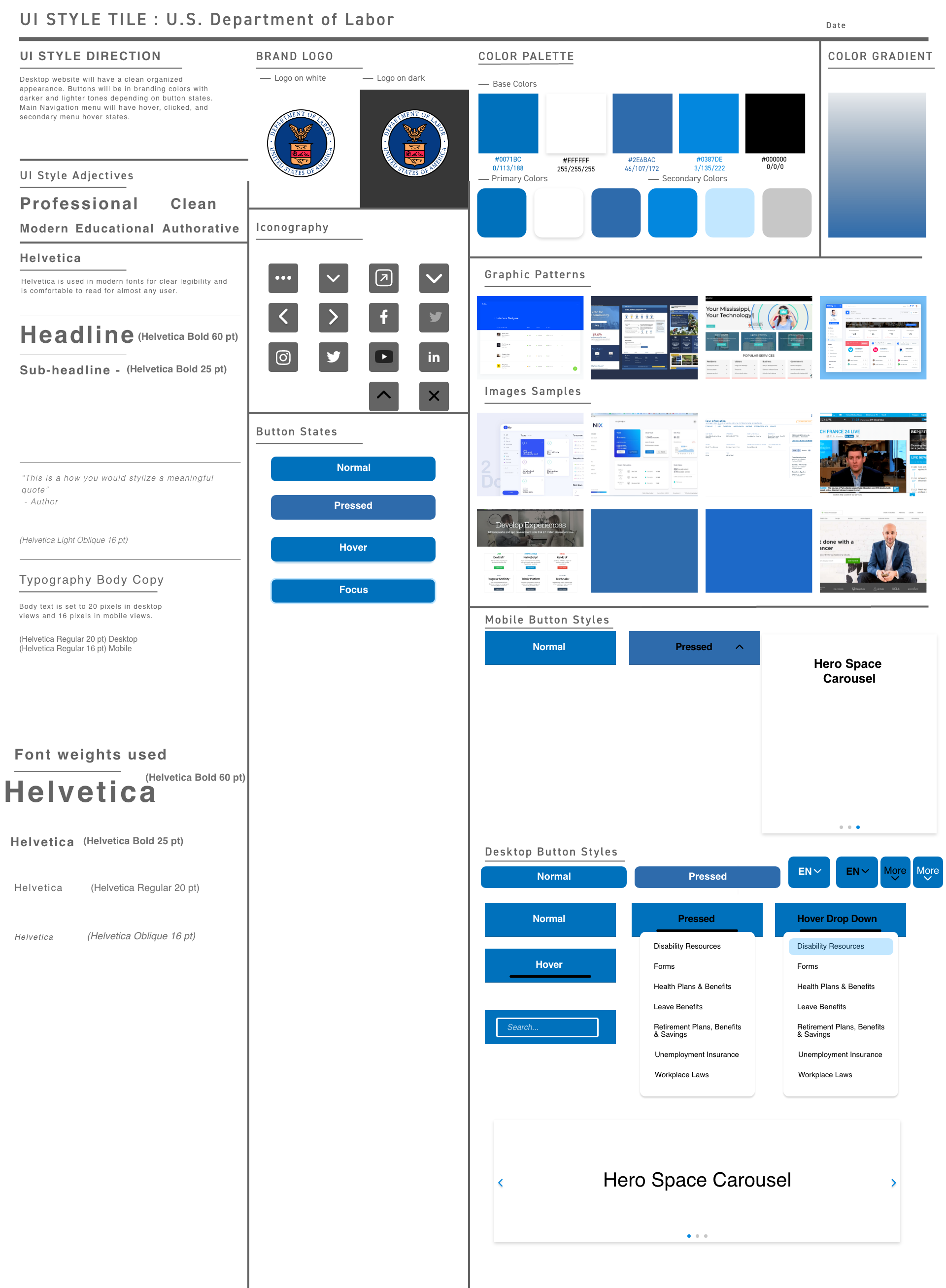
Keeping the website redesign in mind I created a UI Style Guide that bridges both user testing insights and the U.S. Department of Labors corporate branding. I pulled various graphic patterns, a color palette, iconography, and incorporated button states. I kept the the original blues used and added lighter blues to highlight button states and darker blue to show inactive states.
High Fidelity
I applied the new style guide to my hi fidelity prototype for further user testing. This time users felt the website was more accessible due to the incorporated icons and color palette. Text is big and legible, images are relevant to topics, and 4 out of 5 users were able to find their website destination in the top searched links section of the landing page. Users are able to find the resources they need with less clicking and appear visually content with their experience.
Challenges
One of many challenges we faced is contacting the U.S. Department of labor. My team and I had a few roadblocks pertaining to the layout of each web page and needed some answers to effectively iterate our design. We resolved most of the pressing issues by conducting various users tests and utilizing agile methodologies. Above all, we were able to remove pain points, heavy clicking, and unnecessary suggested links. We effectively redesigned the U.S. Department of Labor website and improved it's overall accessibility.