S.A. Food Bank is a not-for-profit food bank that serves all of San Antonio, TX. Their goal is to alleviate hunger in San Antonio by soliciting, collecting and packaging food for distribution through a network of service agencies and programs that serve their target population groups. Their services include food box programs, emergency food programs and health resources for people in need. S.A. Food Bank receives support from the county, charitable organizations and corporate sponsorship.
My Contributions
I was the project manager for the S.A. Food Bank website redesign and was involved throughout the entirety of the project from identifying current problems, creating personas, user flows, wireframes and facilitating team zoom meets to share ideas and thoughts about our processes.
Problem
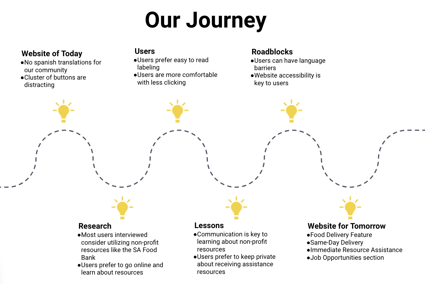
We need to dive deeper into why S.A. Food Bank users are not able to utilize the resources they need. We analyzed the current website to narrow down key factors and road blocks that would prevent users from accessing these resources.
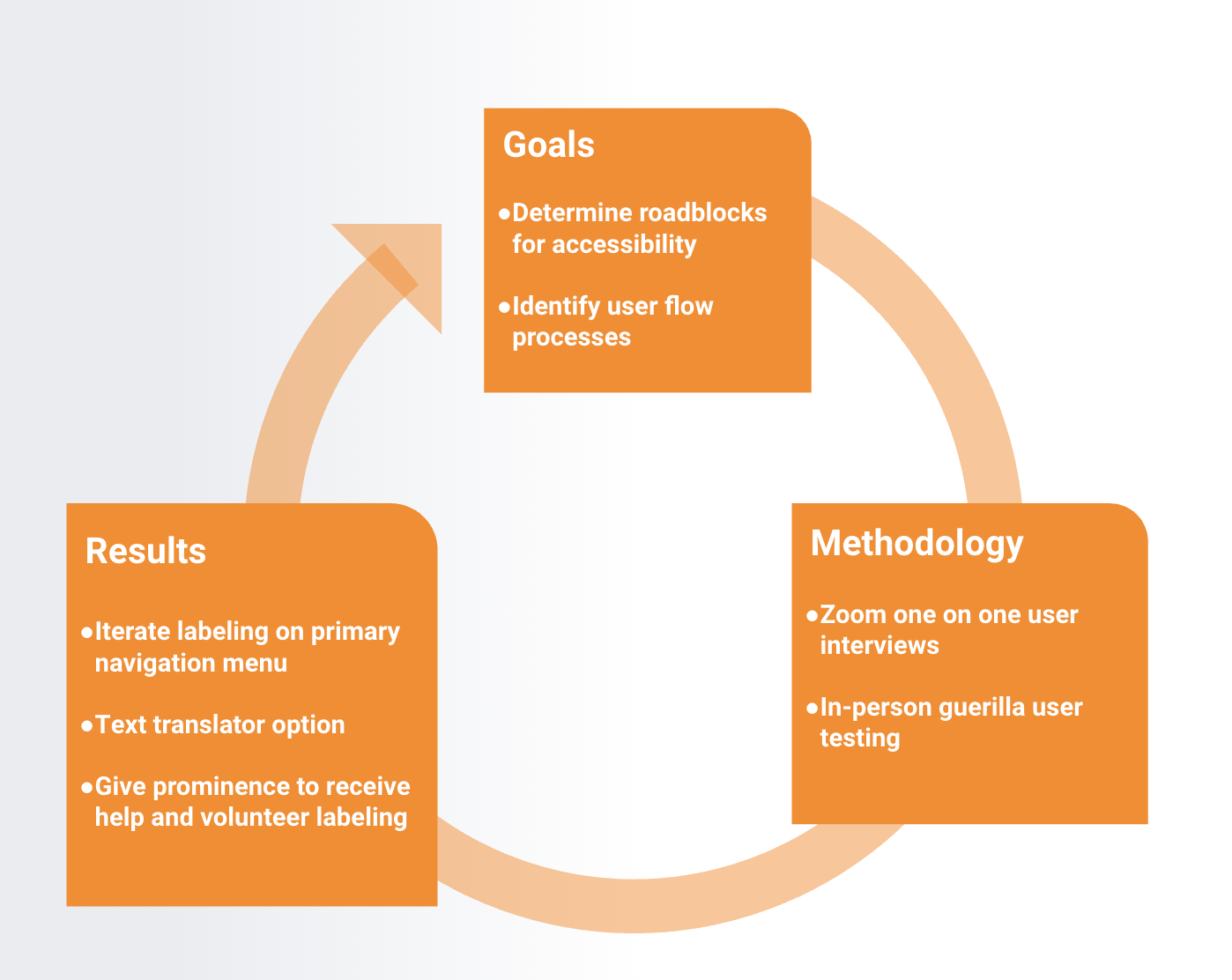
The Process
To further sympathize with our users we conducted six user interviews and sent out a survey through our social media channels. We obtained data that primarily focused on users food access, dietary needs, food budgets and current health concerns.
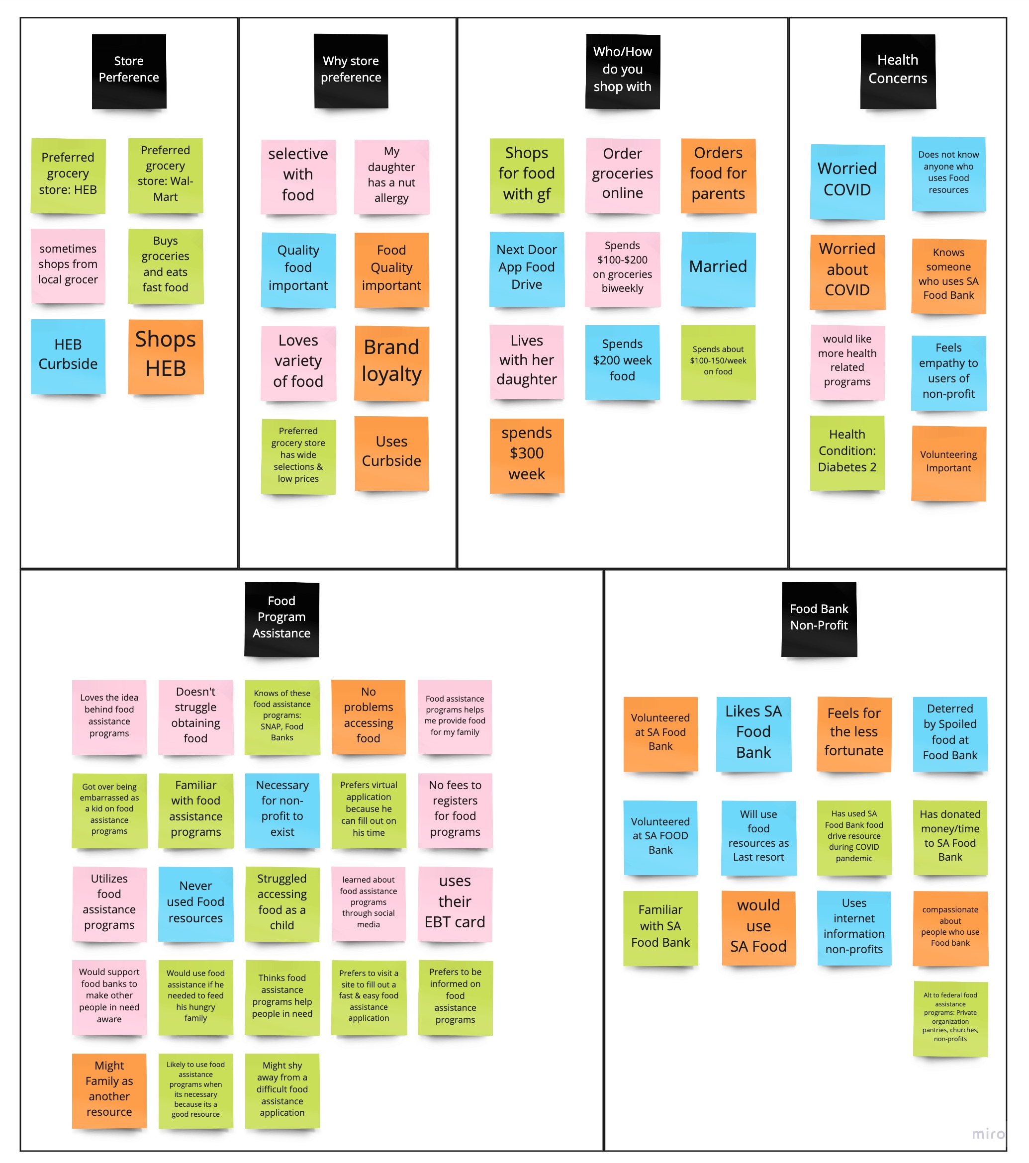
After analyzing our user research we found that the current S.A. Food Bank website does not offer a translate option which is a big key factor in preventing their target community from accessing their resources. Then we prioritized user insights that were overly saturated during our interview processes.
Competitors
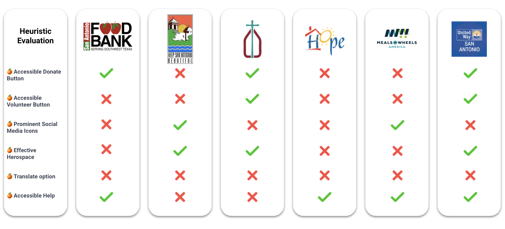
We reviewed our competitors website accessibility, features, translate option, CTA help and donate buttons to learn what made their resources unique to their users. Then we created a competitors analysis board to review our findings and make effective ideations for our prototype redesign.
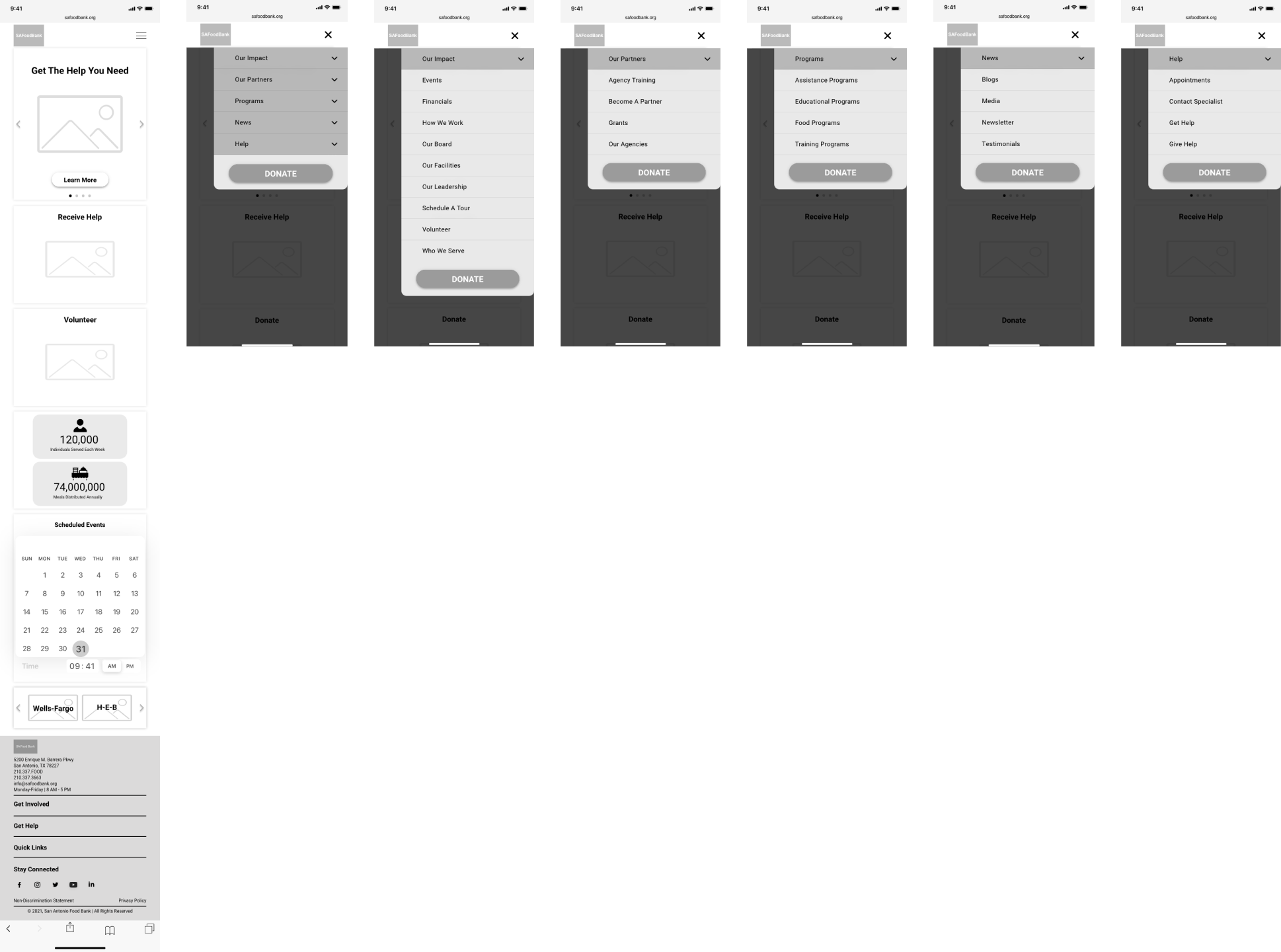
The Redesign
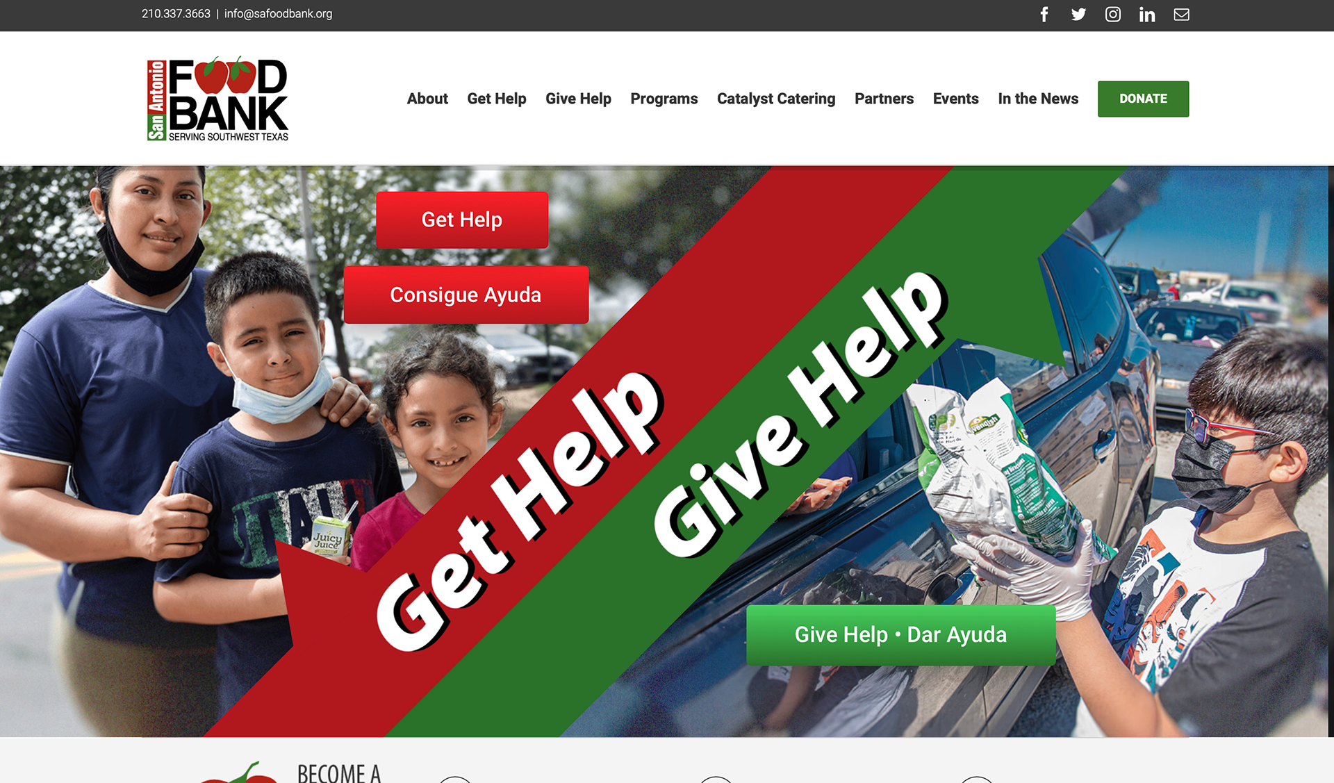
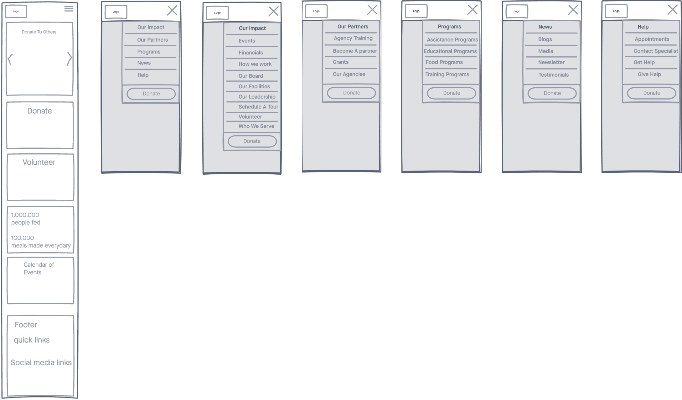
From here we decided what actions were crucial and beneficial when sketching a low fidelity prototype around these conclusions. We wanted to create an accessible user experience for our target users by emphasizing on assistance features, removing language barriers and easily directing users to their destinations.
Findings
We conducted six in-person user testing sessions to identify usability issues and analyze how users interact with our current prototype. We found that our target users would like an English to Spanish translate option, recognizable icons to easily navigate through the website and easy to read labelling.
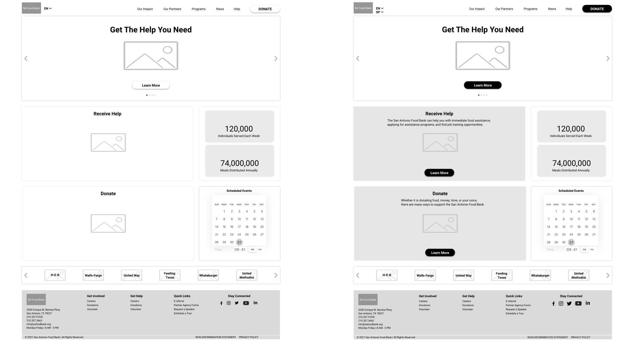
Iterations
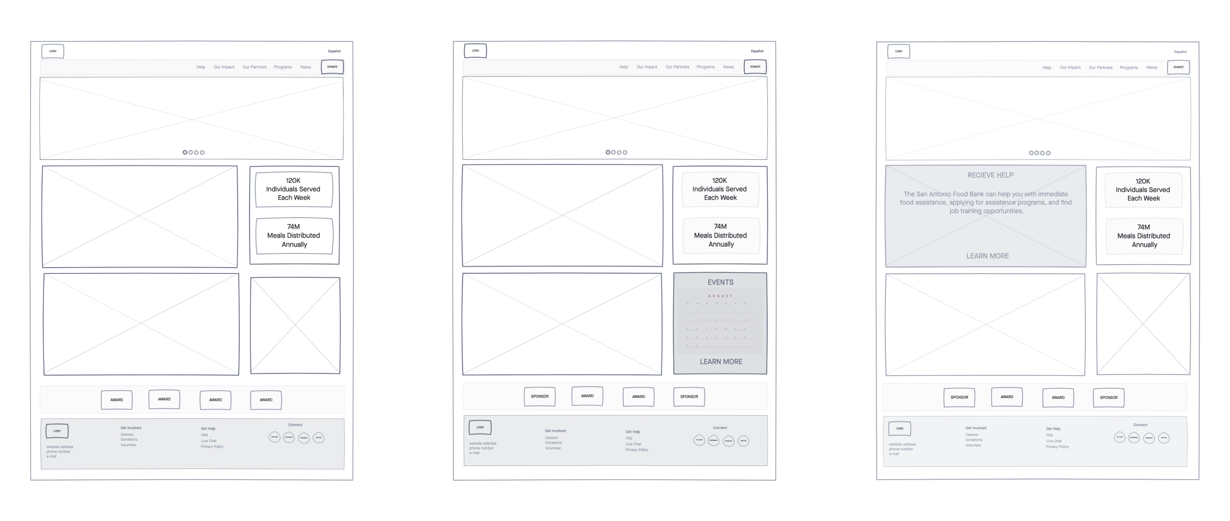
The latest design of S.A FoodBank alleviates user roadblocks with an English to Spanish toggle feature and highlights user accessibility options in bolder tones. We incorporated intuitive UI elements that are recognizable by current and new users. We wanted our users to quickly access food assistance programs, volunteer work and donate.
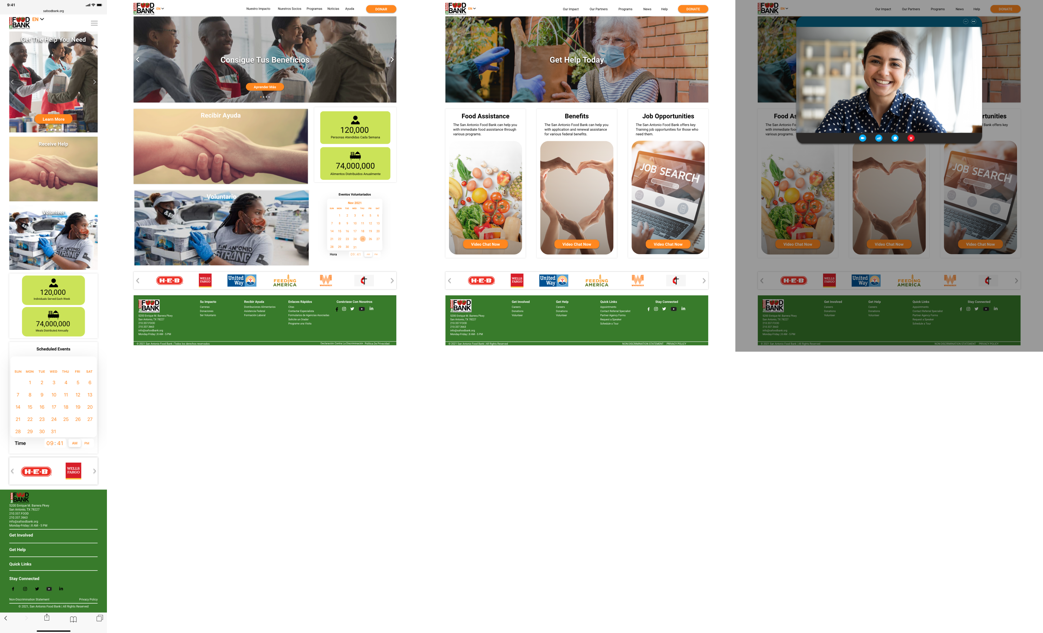
Results
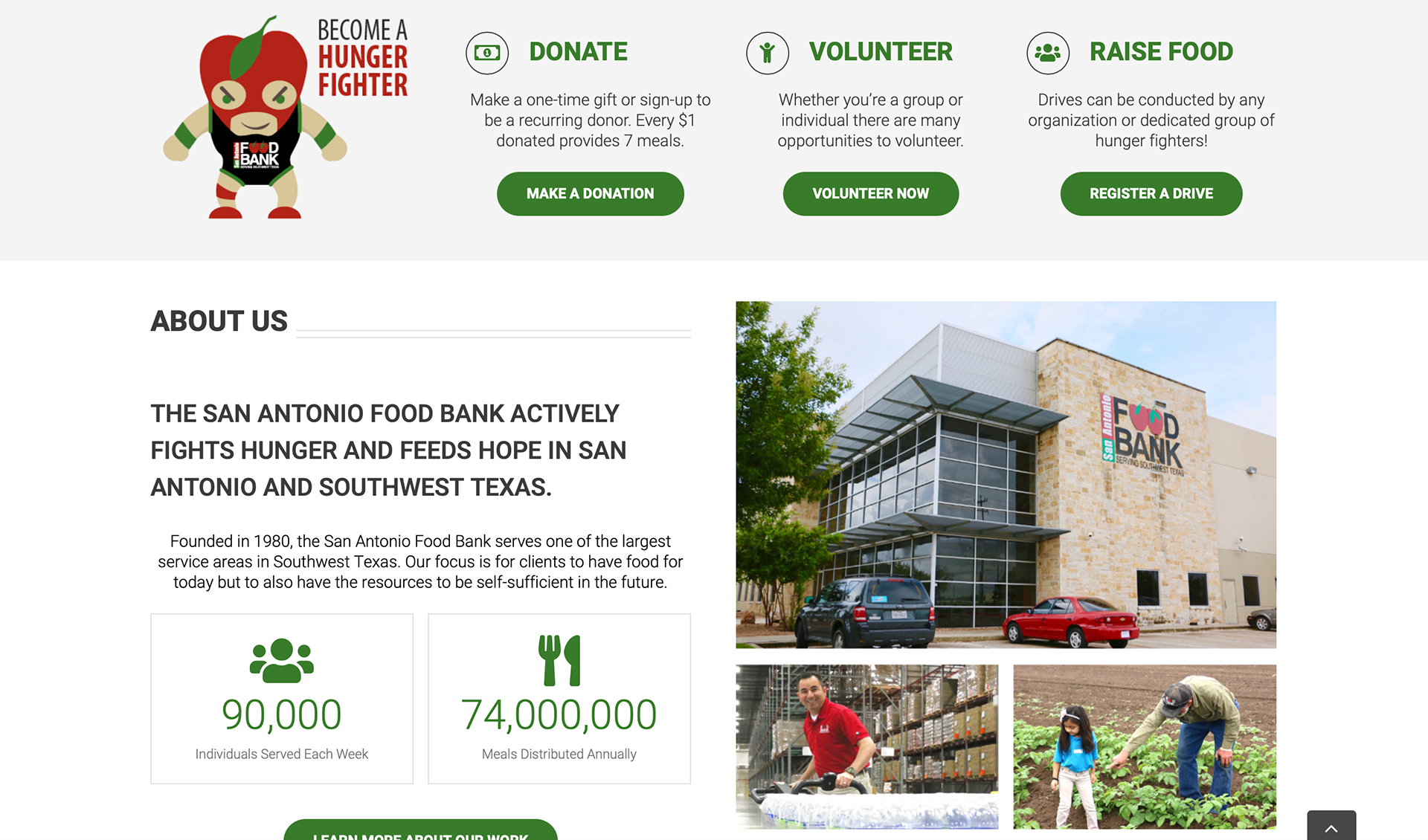
In order to immediately catch the attention of our users, we designed info cards on the homepage with broad topics that would make it easier and more encouraging for users to get help, contribute and volunteer bridging both the organization and user needs. We also included a live video chat feature for both mobile and desktop websites to speak with an S.A. Food Bank representative to receive the assistance users need.
To Conclude
It was important that we made the food assistance process more simple and efficient since our research revealed that many users lack the ability to access help. To address this barrier, we designed an English to Spanish toggle feature where users can click to toggle on the Spanish translate option. The idea behind redesigning the S.A. Food Bank website was to simplify user interactions by giving prominence to resources for users in need. We focused on features that are highly intuitive and can evolve over time based on future user testing.